ShiftOS
A new operating system that focuses on a personalized, integrated experience that adapts to a user’s fast-paced lifestyle.
Key Concepts
User Research, Sketching, Rapid Design, High-Fi Mockups
Group Members
Alexis Koss, Laura Lan, Karen Lee, Lisa Koss, Jordan Kussmann, Eric Ma, & Rebecca Ta
Date
4 months
Instructor
Brian Fling
Tools
Illustrator, & Adobe XD
Role
UX & UI Designer
Overview
I worked as a UX and UI designer on a brand new mobile operating system, named Shift. The Shift OS is an operating system for working professionals that achieves integration of all of its applications which aids in completing daily tasks faster.
Shift offers a personalized experience for it’s users by suggesting applications a user might use more often at a particular time during the day. The operating system also gradually shifts it's color according to the time of day and is also highly integrated with the weather so our users can still remain in touch with the outside world while working to help them stay on schedule. Our operating system adapts to a user’s habits and lifestyle to create a personalized experience that other operating systems lack.
Vision Statement
Shift OS is an operating system for the working professional that will transform their mobile experience by creating a personalized, integrated experience that adapts to their fast-paced lives.
You can view the entire operating system along with its suite of the 15 applications that my team created in the .pdf below.
The Problem
Many working professionals are extremely busy — both at work and outside of it. Often times, working professionals find themselves downloading third-party applications to help maintain their schedules and lives because the ones already integrated in existing operating systems are sometimes lackluster and are missing key features that these users are looking for. Our operating system aims to change this by offering applications that have simplistic designs and interfaces but also are efficient in achieving a user’s goals.
Challenges & Goals
One of the biggest challenges of brainstorming and designing Shift was that we weren’t designing for an already made operating system such as iOS or Android, we were designing for an operating system that we created ourselves according to the design principles that we curated. Building Shift from the ground up in under 10 weeks was a challenging task as we initially struggled to create our design language. We then created 15 applications that also had to be adapted to Shift’s design language while ensuring that each application felt like it belonged to the OS as a whole by maintaining consistency.
Our primary goals while designing Shift was to keep it simple and straight forward with minimal distractions. The design principles that the Shift OS embodies are: adaptability, simplicity, & efficiency.
User Research
Interviews
For our research, we conducted three semi-structured interviews with full-time working professionals to discover what problems they are facing with the use of their current operating systems, such as iOS or Android. These interviews gave us a better insight into the problem that we identified initially while also alerting us of frustrations that we didn't think of. The main takeaways that we found from our research included:
Users find it hard to be organized with the default applications that come with their OS of choice
Default OS applications often don't satisfy a user's needs or lifestyle so they download third-party applications, which reduces the OS's integration across the device
Current operating systems aren't personalized towards each individual user
Personas
After conducting our interviews, my team created two personas that embodied the information that we collected. We thought further about the desires and pain points that we identified from our in-person interviews. We concluded that potential users might:
Be busy balancing work and home life
Focus too much on work at home due to a lack of organization
Want applications that give them complete control over their lifestyle and habits
Want simplistic designs that don't distract from completing daily tasks
You can meet our personas, David and Valerie, below.
David wants to be better prepared for the weather so his family activities go as planned, but he also wants to have better time management so he spends less time on work while off the clock.
Valerie likes to have opportunities to express her creativity and loves using apps that are easy to use with each other to document and share her adventures.
Design Sprints
Five 2-week sprints with a focus on rapid iteration
We had 10 weeks to sketch, wireframe, and prototype the interfaces for our operating system and it's corresponding 15 applications. Our work was broken down into five two-week sprints so we could re-group and talk about what went well and what didn't so we could re-prioritize tasks for the next sprint. We first designed UX guidelines, defined UI styleguides, and created a color scheme to ensure cohesiveness of the operating system itself as well as the applications it would contain.
Design Principles
At the beginning of our first sprint, we came up with three design principles that we wanted our OS to adhere to over the next 10 weeks. Those principles were:
Adaptability - the OS will adapt to a user's habits, creating a personalized experience during different times of the day due to color scheme changes and rotating most frequently used applications
Simplicity - screens will only have the most important elements shown to maintain a minimalistic user interface
Efficiency - all interactions are effortless without unnecessary navigation or gestures to complete tasks
UX Guidelines
Before designing our own OS, we thought about the design choices and experiences that we have noticed in the operating systems that the members on my team use everyday, which included iOS and Android. We noted down fundamental differences between both operating systems while writing down any ideas that we wish the operating system that we used had.
We defined the following UX guidelines after researching the types of user gestures, interactions, and transitions that other operating systems use to determine what kind of experiences would fit our vision statement.
GESTURES will be responsive, natural, accessible
INTERACTIONS will be clear, simplistic, effortless
TRANSITIONS will be quick, integrated, cohesive
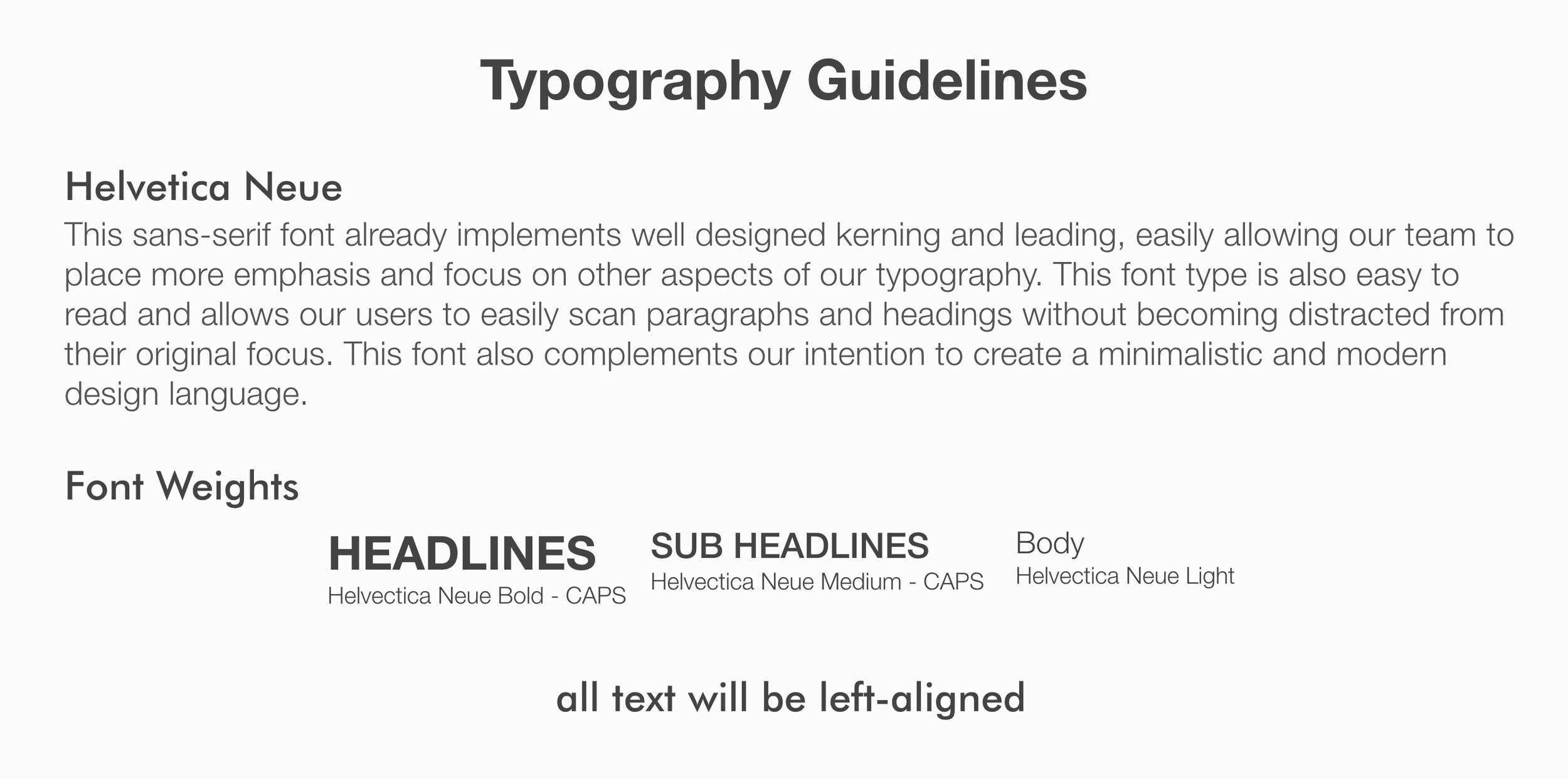
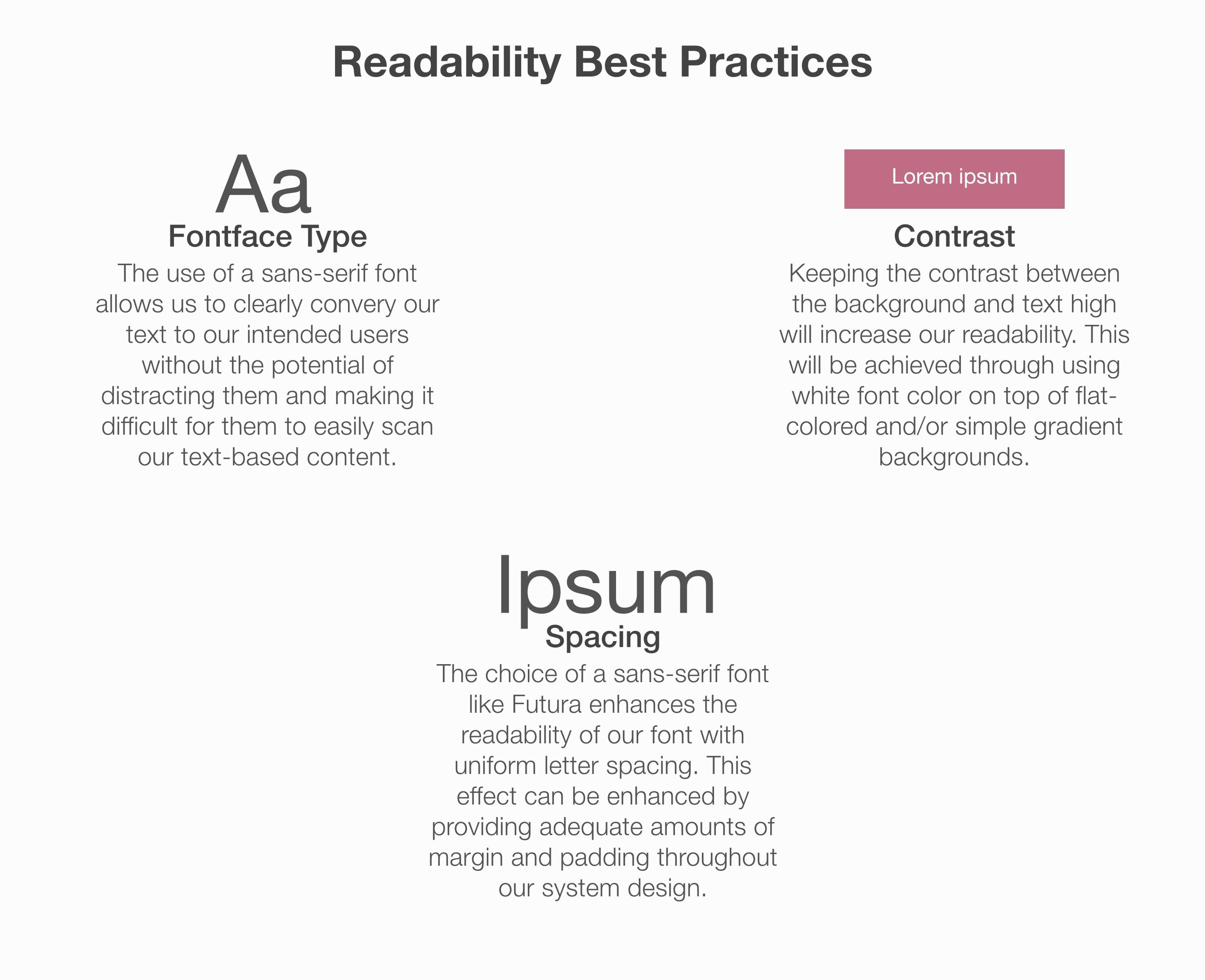
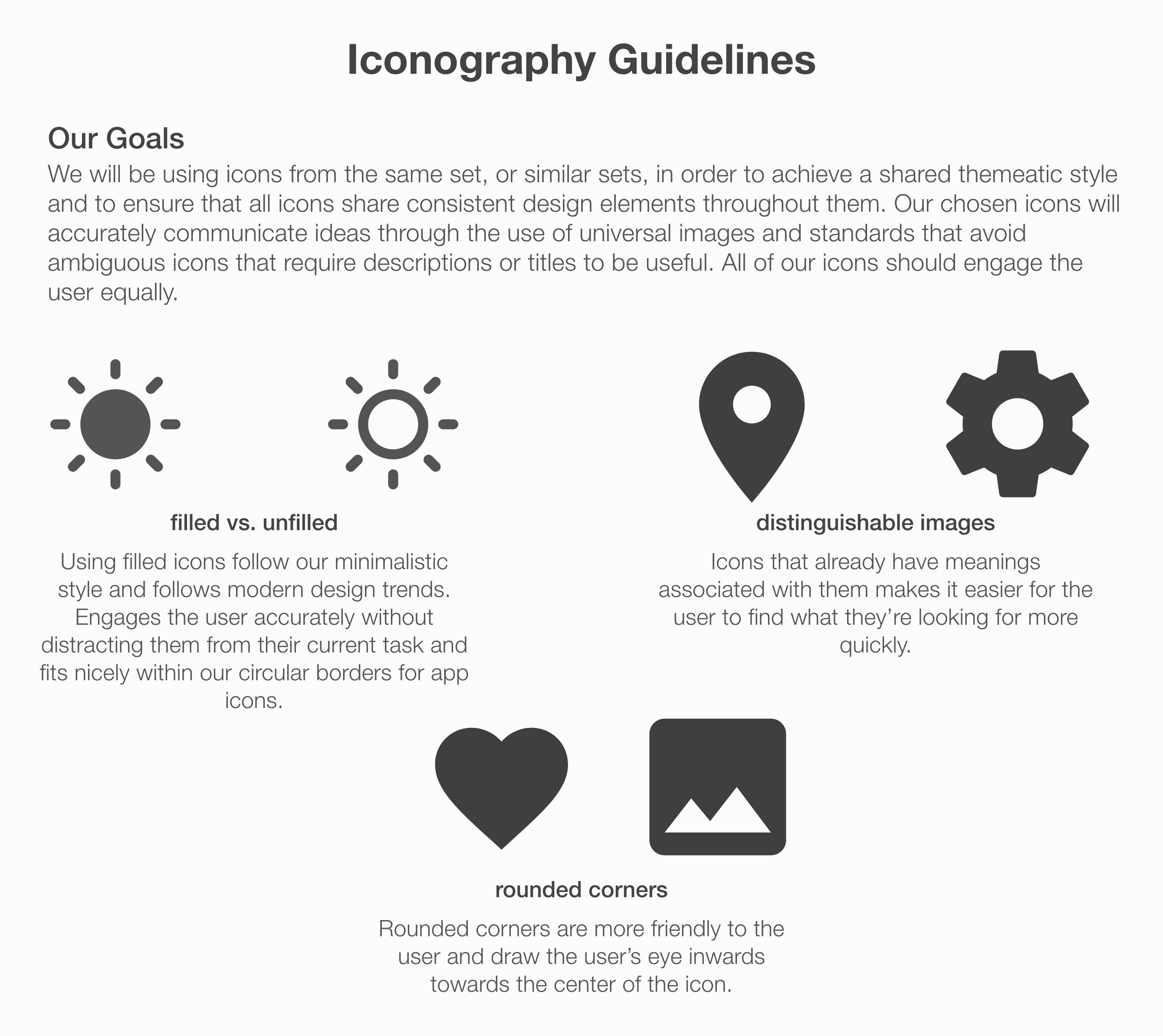
UI Styleguides
The following are my team's typography, readability, and iconography guidelines for Shift that we developed and finalized within the first two sprints. These are the guidelines that we stuck with throughout our entire design process in order to keep the Shift OS and its applications cohesive.
Mood Board + Color Scheme
At first we struggled to initially come up with a color scheme for Shift. Since we wanted to use gradually shifting colors, we knew we had to define gradients that meshed well with each other to achieve this goal. In our initial mood board, we found images that represented what we wanted Shift to look at for varying times of the day, but found that these colors weren't bright enough for some of the palettes and did not blend well from one time of the day to the next.
In our second iteration of playing around the colors, our final color scheme has colors that vary from bright to dark to achieve nice looking gradients that complement their respective time of the day. We also shortened our initial scheme of five color palettes to just four so users can easily recognize the time differences throughout the day without getting confused.


Initial Sketches of OS
While we were defining our guidelines, our team also thought about how our OS should look like in the first sprint and what elements we should display. Initially, we thought that the home screen should be only composed of one screen and should show the top most frequently used applications along with a horizontal swipeable suggestion list that is catered to the user's previously downloaded and used applications. We also placed the universal search in the middle of the screen since it's one of our core features and is how the user accesses applications not shown on the home screen.
We also envisioned how the notification screen would look like, showing a condensed version of what applications have unread notifications at the top along with each individual notification shown in a scrollable list below.
Initial sketches of the home and notification screens.
However, later on in the second sprint, we revisited the sketches above after receiving feedback from our peers and professor about the layout and design of our sketches. We decided to take another look at the home screen (second sketch below) to make it less cluttered and more simplistic while still achieving the same goal of showing a user's most used applications along with the search function.
We decided to ideate how Shift's lock screen would look like at this stage as well. We went with circles instead of squares for the icons to make our OS appear more modern and smooth. In addition to the color changing background representing the time, we also incorporated the weather by adding a big icon of the type of weather that is happening at the moment to increase immediate awareness and efficiency of checking the time/weather.
Initial sketch of the lock screen.
Another iteration of the home screen.
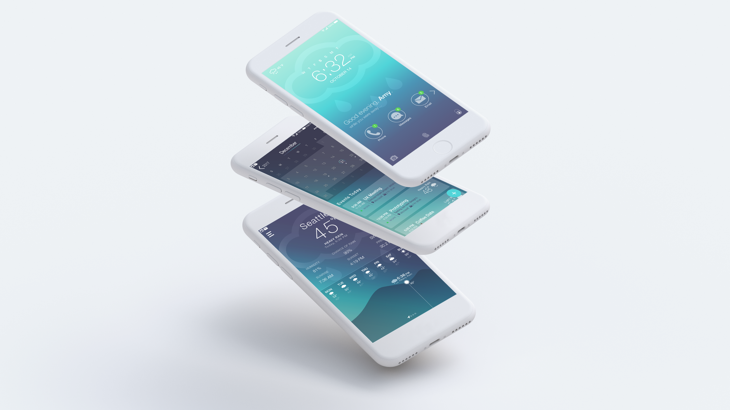
Operating System Breakdown
A look into the Shift OS.
Before designing any applications, my team first had to solidify and fully design the OS that our applications would be on while following the design principles and guidelines that we identified in our very first sprint.
Navigation & Shortcuts
My team knew that we wanted to give the home button a new meaning in our operating system without adding another piece of hardware for the interactive search, which suggests applications to a user based on frequency and time of day, that we wanted to integrate throughout our OS.
To give our users the power that they are in control of their mobile device, we wanted them to be able to access key features at a moment's notice. As a result, they can long press the home button and then use a swipe gesture upwards to access the drawer that contains the universal search, notification center, and settings. By putting the icons in a semi circle, users can
Other notable features in our navigation include the bottom navigation drawer, that includes the back button that is usable throughout the entire device, the gesture swipe drawer, and the tabs button which is accessed with a gesture of swiping up. Additionally, our status bar includes all icons of applications that have unread notifications for a quick, noninvasive reminder while a user is using our OS and any application.
Lock Screen
One of the most prominent features noticeable in Shift is the color changing color schemes throughout the day. This feature is showcased on the lock screen of our OS, which I designed with one other teammate. Depending on the time of the day, the colors will change from a purple/orange for the morning, to yellow/blue for the afternoon, to a combination of blues for the evening, and then purple/blue for night-time before restarting for the next new day.
The purpose of the colors gradually changing throughout the day is to alert users of what time it is without the need to closely look at their phone, eliminating potential distraction. Gradually altering the colors in a gradient gently transitions the user to the next part of their day, creating a relaxing atmosphere despite a stressful work day. An appropriate weather icon is also shown over the background colors, giving users a visual into what the weather is like at the moment so they can help plan their day — whether it's before they get to work or after they get off.
Morning color scheme.
Afternoon color scheme.
Evening color scheme.
Night color scheme.
Notifications are also not immediately visible (only a number is shown) on the lock screen to help prevent users from getting distracted, by replying to a message for example, when checking the time or seeing what the weather is like at the moment.
Home & Search
The home screen encapsulates the universal search feature, which is one of the main focuses of the Shift OS. I worked on the following with one other person on my team.
When a user unlocks their phone, their home screen is populated with their nine most frequently used applications for that time of day. This enables users to find what they're looking for faster while creating a personalized experience that learns from the user's past interactions and time spent with our OS. In our final iteration, we made the icons smaller, in contrast to our last home screen sketch, to make the design feel more minimalistic and less overwhelming to save space for the search section.
If a user needs to find an application that isn't on the home screen, they can search using the universal search and find whatever application that they're looking for immediately, which eliminates the aimless swiping through their phone until that application is located. The universal search also allows users to search within particular applications, such as the Calendar, which can help them find events that they created without the need to manually swipe through their calendar.
Home screen shows a user's nine most frequently used apps, but also allows the user to quickly access the search to find other apps.
The search screen can search the entire phone or just search through one particular app — accessible at any time.
If a user searches the keyword "work" within the Calendar app, they can see all events that are tagged with work.
Final APP Interfaces
A sample of apps that come with the Shift OS.
Below are the application interfaces for the Weather, Calendar, and Camera that I designed either by myself or with another teammate. All of these applications were iterated on over multiple sprints until the entire OS and its suite of 15 applications were finalized. You can view all of Shift's applications in the pdf below:
I designed experiences that are simplistic and efficient and interfaces that are adaptable to each user to fit our three key design principles.
Weather APP
Initial sketch of the main screen for the weather app.
The weather application is one of the key applications for the Shift OS because the weather is an integral part of our target audience's everyday lives. The weather can affect where meetings take place or even after work plans so it's important that users can stay on top of the ever changing weather when they need to.
In the initial sketched iteration of the weather app, I wanted to showcase the weather for that particular day before showing users the forecast for the rest of the week, so I put the forecast near the bottom of the screen. I designed a swipeable list of less important elements above the temperature graph, representing things such as wind or chance of rain, but later on realized from a few rounds of feedback that users usually thought the little dots represented the weather for different cities, as it typically does in other operating systems.
Going off the feedback I received from prior sprints, I made a few changes in the final iteration of the weather app. For starters, I replaced the swipeable list seen in the sketch to represent the different cities a user has chosen to keep track of instead. By laying out these elements without any further interaction by the user, the experience is simpler and straightforward without any hidden attributes. Additionally, I made the temperature graph larger to allow a user to interact with it and visualize the peaks and valleys of the temperature easier.
I also made the design decision to integrate the calendar directly into the weather app to have users avoid having to open the calendar app to compare their events with the weather. This aids in the user's experience because by having applications integrated with each other, it reduces the amount of time our audience has to spend planning their day, adapting to their busy lifestyle.
Weather view for the day and the rest of the week. Includes a moveable point on the graph to track the temperature for the day.
Quick view of the weather for other cities, along with their time zones.
An integrated calendar view in the Weather app allows users to quickly check how their events for the week might be affected.
Calendar APP
The calendar application is also an integral part of the Shift OS because it's one of the main ways that users can keep organized while they're at home and when they're at work. We wanted Shift's calendar application to allow users to be on top of their to-dos so they can balance their home and work life.
In the initial sketches of the calendar app, I wanted to make sure that users could immediately see their tasks for the day as soon as they opened the app. This prevents users from being distracted by other things because they don't have to perform additional steps in the interaction flow to achieve their goals. Color coding each type of task according to its type also minimizes the amount of time a user has to spend reading their calendar.
Initial sketch of the calendar, showing the main view versus an individual day.
In the final iteration of the calendar app, the design stayed pretty similar, except we added another feature to enable our audience of working professionals to stay connected with each other: shareable events where users can directly invite their friends via text, email, or any other form of communication that are automatically added to a user's calendar. We found this feature to be vital to Shift because our audience will know be able to immediately know whether their co-workers can make an meeting without having to download a third-party app.
I also modified the look of a user's daily events on the main calendar view to include the weather so users don't have to open the weather app if they don't need to view additional details about the weather. This minimizes them from being distracted by other apps.

Calendar view shows upcoming events for the day.

Users can quickly swipe from one day's schedule to the next.

Shareable events are integrated into the calendar so friends can be directly invited via text, email, etc.
Camera APP
The camera application is the last application that I worked on for the Shift OS. Our goal for this application was to target users who are knowledge about taking photos and are tech savvy, but also cater to those users who like to just snap photos without much thought before doing so. Our user research uncovered that working professionals often like to document their lives outside of work and some like to make sure that they get those quality shots, even if they had to download third-party apps to do so. To avoid this, we tried to include the qualities that users liked all into one default OS app.
The initial sketches of the camera application are fairly similar to the finished, high-fidelity mockups because we had a clear vision for how we wanted to design this app.
Initial sketch of the camera application. My teammate and I had inspiration from the various camera and camera editing apps that we use on our own operating systems.
In the final high-fiedlity mockups, the camera app allows both novice and advanced users to take control over their photo-taking. Once a user opens the phone, they can adjust camera settings manually or let the camera do it for them. Additionally, photo editing is within Shift's camera app itself, getting rid of the need for a third-party application and making the interface much more simplistic and streamlined, as everything that a user wishes to do with a photo can be done in one interaction flow.

Editing the ISO, one of the many camera properties that users can edit, before taking a photo.

Our camera app allows users to edit the photo after taking it.

All edits are made based on a sliding scale.

Scrollable list of applied edits and filters to the particular image.
Reflection
The Shift OS was the first time I had ever designed something as extensive as an operating system. At first, it was super challenging for my team and I to tackle a task as big as this one. For the first few weeks, we were stumped on what kind of operating system to design and how we could create applications that went along with it. As soon as we sat down as a team for a few hours and thought about what we wanted Shift to be for its target audience, we were able to create Shift's identity.
The main takeaways I took from this project included:
Communication is key. Without it, designers will never be able to understand the thoughts of others on their team and can only guess at how their own designs should fit in.
Always remember the user, their needs, and their wants. Sometimes our initial designs strayed from the wants of our target audience so we always had to remind ourselves that their feedback is invaluable to ensure our solution fits their needs.
The entire process of creating Shift's identity was a real eye-opener because it's clear how important communication, collaboration, and cohesiveness was in order to design Shift and it's 15 applications to make them feel like they were a part of one system. Despite our design styles being different during the first few sprints, we were able to come together as a team during the last two sprints and combine our seven design styles together to ensure that all of our apps followed the design principles of Shift. Working so closely together allowed us to design the solution that our target audience needed.