
Key Concepts
Sketching & Front-End Development
Instructor
Joel Ross
Group Members
None
Tools & Frameworks
Pencil, React.js, Fetch API, Petfinder API, Material Design Lite, CSS, HTML
Date
Oct. - Dec. 2016
Role
UX Designer & Developer
Overview
I worked as a UX designer and developer on a project called Purrfect Match to create a website where users who are interested in adopting a cat can view adoptable cats nearby in their area.
The application includes a search feature that uses Petfinder's API to find cats that are available for adoption that meet the user's specified criteria. Users can either chose to enter very basic information, such as breed or zipcode only, or use the advanced search to specify attributes such as age, gender, or size. Purrfect Match also allows users to compare two cats together so they can complete multiple searches while keeping track of their favorite cats.
The Goal
My goal when designing and developing Purrfect Match was to take advantage of an API, in this case the Petfinder API, and then display the requested information in an easy to read format. I chose the Petfinder API for this project because it gave me access to a database with over 300,000 adoptable pets from 11,000 animal welfare organizations.
I decided to only cater to cats because it allowed me to use a manageable portion of the very large Petfinder database. By narrowing the scope, I was able to focus on optimizing the search feature to display hundreds of results in a concise way by showing only the most important information pertaining to cats. This also allows users to easily compare two adoptable pets, since they're of the same species so they have similar attributes.
Sketches
Interaction Flow
To help develop my idea of Purrfect Match into a physical product, I initially sketched up an interaction flow to visualize how I wanted my users to interact with my application. I knew I wanted three components to my application: a home page to explain what my app is all about, a search page to view adoptable cats nearby, and a comparison page to analyze the traits of a user's favorite cats. Below is a rough sketch showing how I intend my users to progress through my application: from home and then to search where a user might send multiple queries and then view specific details about a cat. If a user decides that they are interested in any cats, then they might want to compare some cats that they might be interested in.
An interaction flow showing how my main components (home, search, and comparison) interact with each other based on a user's actions.
Initial Sketches of App
After sketching the interaction flow, I sketched up some screens to help visualize how I wanted the search and comparison components to look like. For the search, I went with a simple form that allows a user to input their desired characteristics via drop down menus, text fields, or radio buttons depending on the attribute. By using drop down menus, I was able to contain the possible parameters for breed, gender, and age in an easy to scroll list, on both mobile and web versions (seen in first mobile sketch and desktop sketch below).
Once a user submits a query, they can scroll down on the search page to see any returned results that match their criteria (see the second mobile sketch). All adoptable cats that match the user's criteria will show up in a card format, displaying all relevant information concerning that cat in a concise format that is easy to scan at first glance. Clicking or tapping on "details" or "adopt" will pop up a module showing a short biography or information regarding the cat's adoption. I made this design choice to use modules because they immediately grab the user's attention while allowing them to easily discard the module when they are done with it.
I also put the comparison data between two cats into a table to allow the user to quickly scan and compare the information between both cats. Rows in a table make reading of data very simple because the user doesn't get confused as they are trying to compare attributes between two cats since the row directs the user's eye from left to right.
I went with a mobile first approach when sketching to ensure that all elements would be able to fit on devices of all sizes. The advanced search section is initially collapsed, but expands whenever a user taps or clicks it. This maximizes mobile device space by showing only the most important elements first.
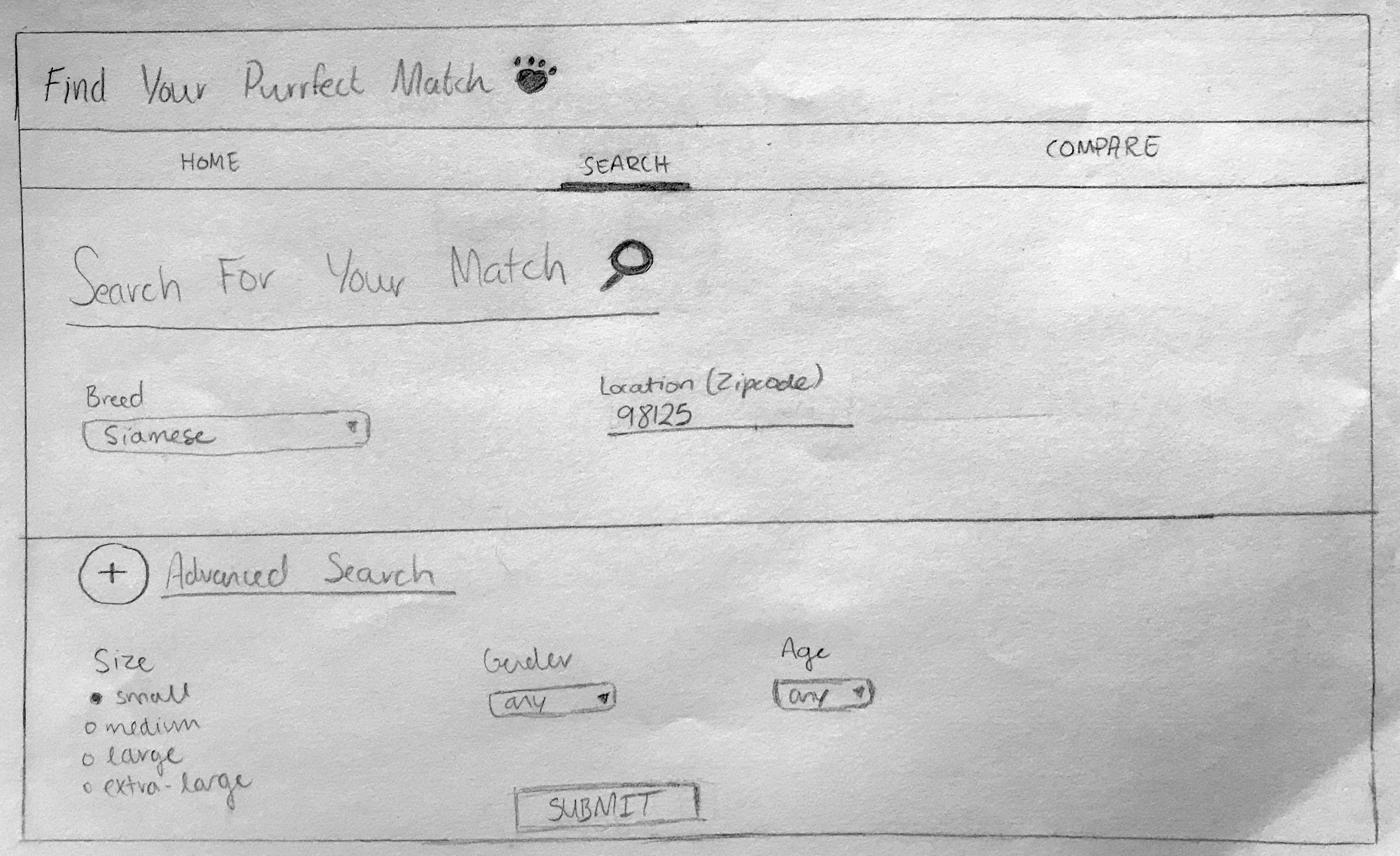
To get a better idea of how I wanted the search screen to look like on a desktop device, I also sketched it out. However, I expanded the advanced search section to show the types of parameters users can search for when submitting a query.
Another design choice I made was to allow navigation between the different components through the use of tabs near the top of the screen. I decided to keep page navigation toward the top of the screen because almost all other actions completed by users will be near the bottom of the screen, such as clicking the details, adopt, or compare buttons on an adoptable cat. By separating both means of navigation, users won't accidentally click on the wrong button while competing their intended task. Also, by using tabs, users can switch views quickly and are aware of what alternate views are available immediately upon using Purrfect Match.
Development
The Petfinder API gives me access to a database of over 33,000 adoptable pets and is very well documented so it was an excellent choice when I was searching for an API to use. An API call returns either XML or JSON. I decided to use JSON because I could easily read the data with the Fetch API. After reading the data, I could extract the pieces of information that I needed from each request in order to populate each cat from the query results into the cards that the user sees.
Example JSON returned by an API call searching for cats within the zipcode of 98125. This JSON shows only one result from the user's query.
After figuring out what data I can get back with each API call, I started to think about what methods I could employ to code this project and bring it to life. I decided that I would use React.js in combination with the Fetch API to handle the request and response objects from the Petfinder API. As soon as a user inputs their desired parameters and presses the submit button, the Fetch API takes those parameters to make the request. When a response object is returned, I analyze it so I can store the required information in a card that is then shown to the user (second screen below).
After the user inputs their search parameters, they can press submit to see if any cats match their specified qualities. All parameters under advanced search are optional to give users the freedom to decide the scope of their searches.
The search results are shown in a card format because it allows users to scan for the information that they're looking for without getting confused about what information belongs to which cat. Only concise, important information is shown immediately — more detailed information is put into pop-up modules.
React.js made it effortless to keep track of the user's state between both their search query and comparison calls. No matter what component the user is interacting with, I could keep track of a user's history and transfer their state between each component visited (e.g. search to comparison).
As soon as a user initiates a search, they can click compare on any two cats that catch their interest. When they do, they can visit the comparison tab to see how those two cats are similar or different from each other, helping to inform their choice of which cat the user may want to adopt. With the use of React.js, transferring the state of a user's search to the comparison component was easy and eliminates the difficulty a user would experience if they had to manually input the two cats they wanted to compare on the comparison tab instead of directly via the search tab results.

Clicking on the details button will pop up a module with a short bio about the cat. If a user is interested, they can also click the adopt button to be informed by another module of how they can adopt the cat that they're looking at.

The comparison tool gives users the ability to compare two cats that they may be interested in adopting. Is this cat bad with dogs? Can this cat be around the other cats that I already have? These are some of the questions users get the answers to while comparing two felines.
I also used Material Design Lite to keep a consistent design across the entire website. Because Material Design Lite uses React.js as well, having reusable components from Material Design Lite's library made it super simple to ensure that my app had a consistent design and feeling. This also gave me the ability to re-use pieces of my code, such as the navigation tabs, across multiple components, such as home or search, by writing just one line of code after the initial component was written.
My final product matches my interaction flow and initial sketches pretty much spot on. During development, I did not see a need to change anything because I had thought out my use cases fairly well with the interaction flow before sketching out how I envisioned my final product to look like.
Reflection
Throughout this entire project, I learned a lot about React.js and how to incorporate Material Design Lite into what I coded to make it look the way I wanted it to. This was the first big project that I ever developed with React.js based on completely my own idea and design principles. I believe I executed my final product and design well to achieve an excellent user experience because of the thoughtful planning that I did before I started to develop. This prevented me from scrambling to figure out how a user should navigate from one action to the next.
It was challenging attempting to figure out how to use an API for the first time with React.js, but slowly figuring out how to componentize different parts of my code enabled me to learn all about the inner-workings of React.js and how it can work with other libraries and APIs, giving me the knowledge to code more complex projects in the future.